Fitting Approximating Functions
Interpolation and Root Finding
An approximating function is nothing more than an equation which is used to represent X-Y data. An approximating function can be used for interpolation, finding a Y-value for an X-value that is within the X range of the data or alternately, finding an X-root or roots for a Y-value that is within the Y data range.
Extrapolation
An approximating function can also be cautiously used for extrapolation, the process of finding a Y-value for an X-value outside the X range of the data or alternately, that of finding an X-root or roots for a Y-value that is outside the Y range of the data.
Derivatives and Integrals
Approximating functions can also be differentiated or integrated, both numerically and analytically, resulting in far more accurate areas under curves, inflection points, cumulative areas, and other aspects of data analysis than would be realized by working with the raw data. An approximating function is also the finest form of data smoothing in the time domain.
Linear Models
What is important in an approximating function is seldom the coefficient values derived from the fit, but rather the effectiveness of the fit itself. Equally is the number of coefficients of minor importance. For this reason, linear models are most frequently used for approximating functions. In the example that follows, the best candidate equations are linear models.
Creating The TableCurve Studio Data Table
Start TableCurve Studio. Select Start/Programs/TableCurve Studio v5.
The first step in using TableCurve Studio is to create an X-Y Data Table. TableCurve Studio can construct its data table from any of the following:
-
- ASCII files [X-Y, single column, multi-column]
-
- Excel v3-v5,95,97,2000 spreadsheet files [XLS]
-
- Lotus 123 spreadsheet files [WK4, WK3, WK1, WRK, WKS]
-
- Quattro Pro spreadsheet files [WB2, WB1, WQ1, WKQ]
-
- SigmaPlot worksheet Files [JNB, SPW, SP5, SPG]
-
- SPSS v8-v10 data files [SAV]
-
- Systat v8,v9 data files [SYS]
-
- dBASE III+ and dBASE IV database files [DBF]
-
- DIF files [X-Y, single column, multi-column]
-
- Binary files with repeating data blocks [with binary configuration]
-
- X-Y Data entered directly into the TableCurve or ASCII editors
TableCurve Studio offers a maximum table size of 65536 rows, and further offers an import-level averaging digital filter where up to 65 million values can be filtered into TableCurve Studio in a single step.
 Select the File menu’s Import option. Click on the Files of Type drop-down button and select Excel [xls] files. Select and open the file SAMPLE.XLS.
To aid in the identification of the columns, TableCurve Studio lists the string data existing in the first 100 rows of the individual sheets or pages in the worksheet file. You must have at least one entry within the first 100 rows of a column in order for that column to be available for selection.
Select the first column with the label Tour 1: Approximating Functions Temperature to be used as the X-variable in the TableCurve Studio data table.
Select the column identified in the selection list as Conductance for the Y-variable. Check Import Preview to see a graph of the data that will be imported.
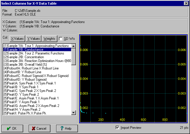
Note that the first two selections are automatically placed in the X and Y positions. You may double click on the column for the Y variable in order to immediately proceed with the import operation. You can also revise the initial X,Y selections as well as to specify a column to be used for the weights. The weights can be optionally imported as standard deviations.
Press OK to accept these choices. Press OK once again within the titles dialog to confirm the imported titles.
The selected columns of data are read and a summary is given for the read operation. 21 data points are read.
 A background thread fitting may automatically occur as soon as the data is imported, depending on the Background Thread Processing option currently selected. For the purpose of this tour, we will ignore any background thread fitting that takes place.
Once the data has been imported, TableCurve Studio proceeds to pre-scan the data table for basic statistics. At the conclusion of the import, a status window appears with these statistics and a graph of the data.
Calculation
The Y-values are in units of millimhos. We will use a calculation to adjust these units to micromhos.
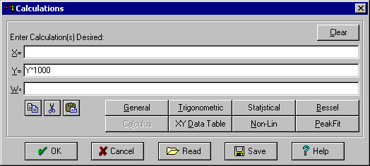
 Use the Data menu’s Enter Calculation item and enter Y*1000 on the Y= line. Press OK and then answer Yes to immediately apply the calculation to the existing data table.
You will then see TableCurve Studio’s standard Undo graph. This type of graph offers the means to graphically inspect the results of certain procedures before accepting the modifications.
Press OK to accept the Y-value changes introduced by the calculation.
Sectioning Data
 Select the Data menu’s Section Data item.
 Click on the Logarithmic X Axis button in the graph’s toolbar.
The data reveal a relatively constant conductance until absolute zero is approached. For the purpose of this tutorial, we shall assume that a temperature of 1°K was the experimental lower limit, but that an extrapolation is desired for values closer to absolute zero.
Individual points are toggled on and off simply by left clicking on them.
 In X-Sectioning Mode, bands of data are rendered inactive by placing the cursor on the graph at the left border of the desired range and then pressing and holding the left mouse button down while sweeping to the right. Bands of data are reinstated for fitting by the reverse procedure of placing the cursor at the right border of the band and then sweeping the mouse to the left.
 In XY Sectioning Mode, the mouse is used in the upper graph to enclose the x-y region of interest. To include the region that is to be graphically defined, click and hold down the left mouse button at one corner of the x-y rectangle in the upper graph and drag the rectangle so that it encloses the region desired. To exclude the region that is to be graphically defined, the same graphical procedure is followed except that the right (rather than the left) mouse button is used.
The upper graph is scaled only for the active data and the lower graph is scaled for all data, regardless of the states of the individual points.
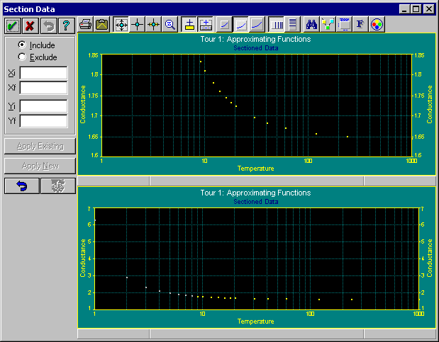
Experiment with turning bands of data on and off and with changing the status of individual points.
 Press Cancel when done since we want to have all points active for the fitting. The status window should indicate 21 active points for the fitting.
Automated Processing
The TableCurve Studio engine processes the data table with up to 3491 built-in linear equations and up to 174 built-in non-linear equations in a highly automated single step.
Because of the numerically intense nature of this processing, the time required for the fitting that follows will vary in relation to the computer’s floating point processing speed. TableCurve Studio reports a floating point index (FPI) in the status window. The reference FPI is 100 for the original coprocessor-equipped IBM AT. A computer with an FPI of 50000 will process the data table 500x faster than this vintage AT.
A list of the full 3665 TableCurve Studio equation set is available on-line from the List Equations item in the main TableCurve Studio Help menu.
Customizing TableCurve Studio’s Fitting
TableCurve Studio offers a high level of optional customization.


 The Curve-Fit Peak Functions, Curve-Fit Transition Functions, and Curve-Fit Kinetics Equations options have their own separate configurations which combine specific function selection with all non-linear controls appropriate to these types of functions.

 The Curve-Fit Custom Equation Set item fits the specific equation set constructed via the Edit Custom Equation Set option.
 For all fit options except the peak, transition, and kinetic functions, the Curve-Fit Preferences option is used to set the various fitting controls.
Select the Process menu’s Curve Fit Preferences option.
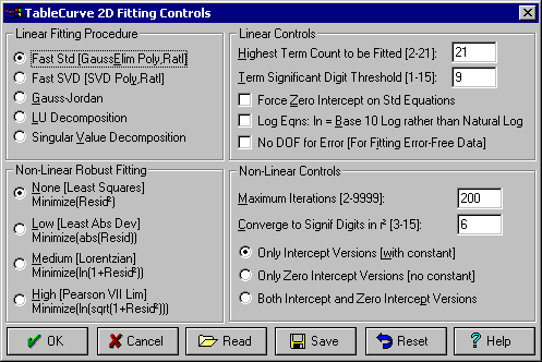
The default Highest Term Count to be Fitted of 21 accommodates all of TableCurve Studio’s equations. The default Term Significant Digit Threshold of 9 means that an equation will be added to the list if each of its terms essentially makes at least a 1E-9 fractional contribution to the Y value. The Force Zero Intercept on Std Equations option automatically forces a zero intercept when fitting TableCurve Studio’s 3205 standard (non-polynomial, non-rational) linear equations.
You can also force base 10 log functions and for handbook or generated error-free data, you can disable disable the degree of freedom normally allotted for the error of fit.
The Fast Std linear fitting procedure uses a mix of methods for resolving both the solution vector (coefficients) and the matrix inverse (errors and confidence limits). This offers the fastest possible fitting. The Fast SVD is similar except that singular value decomposition is used for the conventional fitting of higher order polynomials and rationals. This can sometimes result in more stable coefficients. You should choose one of the other options only if you have extensive experience with matrix methods and wish to employ a single method for all numeric processing.
Press OK to close the preferences dialog.
Fitting the Linear Equations
In this tutorial we will be fitting a predefined equation set, that of all linear equations. At this point, we will initiate the automated curve-fitting.
 Select the Process menu’s Curve Fit Linear Equations option.
The entire curve-fit will occur automatically. You may cancel an automated fit in process by pressing the Cancel button. In the automated fitting, there is first a sums generation process. This is followed by the fitting of all 3491 linear equations.
When the fit is complete, you will see that over 2100 equations were added to the fitted set. A fast Pentium machine should require about a second for this fitting.
When the fit is concluded, enter the Review by clicking the Graph Start button.
 As an alternative, you may press OK and select the Graph Start item in the Review menu. If you do not respond to the conclusion of the fit in 10 seconds, the Review is automatically started.
Reviewing the Fits
At the conclusion of the fit, equations with insignificant terms have been removed from the equation list. Other equations may be absent because they were not fitted. For example, there is no point in fitting an equation with a ln(x) term if there are negative x values in the data set.
Click on the Logarithmic X Axis button in the Curve-Fit graph’s toolbar.
Using the List menu of the Curve-Fit graph, or the Sort menu of the Equation List, select the Sort by DOF Adjusted r² item.
This sorts the fitted equations by a degree-of-freedom adjusted coefficient of determination. For approximating functions, you will almost always want to sort by DOF Adjusted r² or the Fit Std Error, both of which order the equations based upon a degree-of-freedom based least squares criteria.
The equation at the top of the list, #6204, is a balanced-order polynomial. The Curve-Fit Graph consists of a plot of the highest ranked equation:
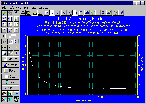
We will now choose from among the candidate equations to select the one best suited to this application. Note that the Equation List contains fewer equations than the number successfully fitted. The absent equations are rationals with an undefined region or pole in the X-range of the data that have been filtered out of the list by the default Rationals Defined Xmin-Xmax option. You will not normally be interested in such rational equations. All other equations will initially be present.
We will first set the scaling for the extrapolation.
 Click on the Modify Graph Scaling button in the graph’s toolbar. For the X-axis, be sure the Log box is checked, uncheck the Automatic box, and and enter 0.1 for the minimum, 100 for the maximum, and 3 for the divisions. For the Y-axis, check the Log box and uncheck the Automatic box, and enter 1 for minimum, 10000 for the maximum, and 4 for the divisions.
The graph should appear as follows:
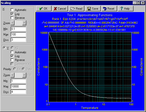
Click OK to accept the Scaling settings.
Equation #6204 Balanced Order Polynomial
The highest ranked equation is a balanced order polynomial. Such polynomials contains both standard and inverse terms. The next two equations in the list are also balanced order polynomials. The next five ranked equations consist of non-linearly fit constrained rational models.
Explore the first fifteen ranked fits by selecting the equations within the Equation List window.


 You can also use the arrow buttons in the Curve-Fit Graph’s control panel to step through equations.
If the Equation List window is active, you can also use the cursor keys.
If the Curve-Fit graph window is active and you have a scroll-wheel mouse, you can scroll the equations using the mouse wheel.
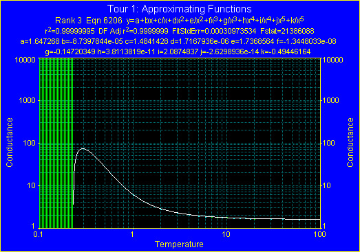
Note the vertical lines that are drawn with the third ranked equation. These lines represent an undefined condition or math error. Here, the function is merely undefined on a log scale since it evaluates to negative values.
Simple Equations Filter
All of the initial equations in the list are linear equations. To see how well TableCurve Studio’s simple two-parameter linear equations fared with this data set, we will apply a simple filter.
Using either the List menu of the Curve-Fit Graph or the Filter menu in the Equation List window, select the Simple Equations option.
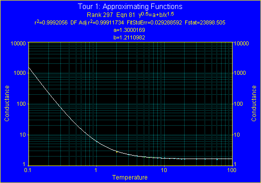
Although there are nearly 300 equations with a better DOF adjusted r², the best of the simple 2 parameter models offers a very respectable fit.
Derivative Filtering
The filter we want is one that will assure a continuously increasing trend in the region of extrapolation.
Using either the List menu of the Curve-Fit Graph or the Filter menu in the Equation List window, select the Set X-Range for Derivative Filtering option and enter 0.1 for the minimum X value and 100 for the maximum X value. Also check the Logarithmic Intervals check box and then click OK to exit the dialog.
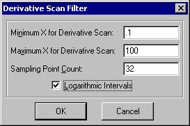
This sets the scan conditions for the Continuous Trend First Derivative and Constant Sign in First Derivative filters but does not automatically select one of them.
Using either the List menu of the Curve-Fit Graph or the Filter menu in the Equation List window, select the Continuous Trend First Derivative option.
This filtering may take a few seconds since there are 2100 equations and each equation’s first derivative will be evaluated at 32 logarithmically-spaced X-values to determine if a continuous trend, either increasing or decreasing, exists across this range.
When this filtering is complete, you should see that the list has been reduced to 696 equations. The two highest ranked equations remain at the top of the list. The rank always reflects all fitted equations as ordered by the current goodness-of-fit sort criteria. Note that only five of the top twenty ranked equations offer the desired continuous trend in the specified region.
Step again through the highest ranked equations and note that all have the desired trend for the extrapolation. When finished, return to the top ranked equation.
The FP Item for Scientific Programmers: Execution Speed
The third item in the equation list is an estimate of the floating point complexity of the equations, based on TableCurve Studio’s own code generation option. For approximating functions, the "simplest" equation may well be the fastest executing one, not the one with fewest coefficients. TableCurve Studio will automatically generate code with 15 or 18 digits of precision in the coefficients. An FP value of 1 corresponds to an Intel FPU addition. An equation with an FP of 45 should require about three times as long to execute as one with an FP of 15. Note the significant variation in execution speed relative to the number of parameters.
SE Colored Residuals
Note the coloring of the points based upon the number of standard errors represented by the residuals. If you are using a predefined color scheme, the points less than 1 standard error from the curve will be blue in color. Green points are between 1 and 2 standard errors, while yellow points are between 2 and 3 standard errors, and red points are beyond 3 standard errors.
Confidence and Prediction Intervals
The confidence intervals are a measure of how accurately the average curve for repeated experiments is determined. The prediction intervals measure how accurately an individual curve is determined. The prediction bands will always be wider than the confidence bands. For approximating functions, the prediction intervals, which deal with the confidence about the predicted Y values for the next experiment, will be the main ones of interest.
 Click on the Set Confidence/Prediction Intervals, %Confidence button in the graph’s toolbar. Be sure the Prediction type of interval is checked, the Confidence type of interval is unchecked, and that the 99% level is checked. Click OK.
The 99% prediction interval is a rather demanding confidence interval. Still, the intervals in the region of extrapolation are very tight and are very close to the actual curve.
Searching A Specific Equation
To observe wider prediction intervals, we will inspect an equation whose fit produces significantly larger errors.
 Click on the Search for Specific Equation button, enter equation 17, press OK, and observe the wider intervals about the fitted curve.
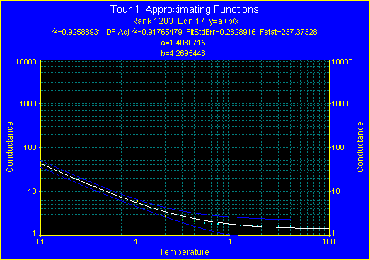
 Click on the Show Confidence/Prediction Intervals button to toggle off the intervals.
Click on the double up arrow button to move back to the top of the list.
Note that the computation of intervals is highly sensitive to machine precision, especially outside the X data range. When confidence intervals errors occur in the data range of interest, you should assume the equation is only marginally stable in this region.
Also note that careful judgment is required in extrapolations. The tight prediction bands of a given equation hardly match those of different but also highly-ranked equations.
Fit References
The question at this point is no longer whether Equation 6204 is a suitable approximating function, but how far such a model can be trusted in extrapolations toward absolute zero. In this data set, as in any form of extrapolation, it is important to remember that the equation is based only upon the presence and magnitude of physical phenomena in the range of the data. For example, wild forces could come into play at temperatures below 1°K that have little presence above, where the actual experimental data ends.
To determine how far to trust this extrapolation,we will now set this highest ranked fit as a reference.
 Click the Add Current Equation as Reference button (or the Add Current Equation as Reference in the Reference menu).
Initially, the reference and current curve will be identical, overlapping one another.
Select the third equation in the list, Equation 6308 and again click the Add Current Equation as Reference button.
Select the fifth equation in the list, Equation 6503 and again click the Add Current Equation as Reference button.
Select the sixth equation in the list, Equation 6203.
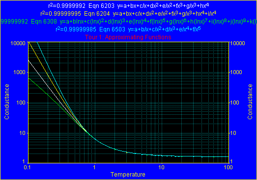
Note that there is a considerable divergence in the extrapolations among these four excellent fits.
Use the arrow buttons or the equation list to inspect some of the other equations against this set of references.
When done, use the double up arrow button (or select Equation 6204) to return to the highest ranked equation in the list.
 Use the Toggle Display of Equation References button to disable the display of the references.
Evaluation
The Eval item is used to open a full-featured numeric evaluation of the equation currently selected. An evaluation table will contain a history of all numeric operations requested. We will use both a single entry and an automatic generation procedure for adding information to this table.
 Use the Eval button to open TableCurve Studio’s Evaluation procedure.
 Enter .5 in the X field and click on the y=f(x) button for a simple function evaluation.
Enter .1 in the X field and again click on the y=f(x) button.
 Successively enter 100, 1000, and 10000 in the Y field followed each time by pressing the x=root(y) button.
 Click on the Generate Table button. Be sure the options are set to Generate the data To Evaluation Table where X is Input, Y=Fn at X before pressing OK. Enter .01 as the initial X value, .01 as the increment, 1.0 as the final X-value, and then press OK.
You will see 100 function evaluations added to the table.
Again press Generate Table but now select the Y is Input, X=Root of Fn at Y option. Enter 100 as the initial Y-value, 100 as the increment, and 10000 as the final Y-value and press OK.
You will see 100 roots added to the table.
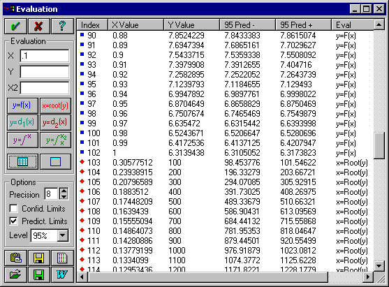
This generation option can also be based upon data that is read from a column in an ASCII, Lotus, Excel, Quattro, SigmaPlot, SPSS, Systat, dBase, or DIF file.
When Confid. Limits or Predict. Limits is checked, two additional columns containing the confidence or prediction intervals are added to the evaluation table for both function evaluations and roots.
The entries in the evaluation table can be printed, copied to the clipboard, or saved to file in an ASCII, Excel, Lotus, SPSS, or Systat format. The data can also be listed, streamed to MS Word, and saved as an RTF report. The evaluation sequence can also be saved to disk and recalled at some future time for use with a different set.
Select the second ranked equation. Note that the Evaluation table is automatically updated. Return to the first ranked equation. Click OK in the Evaluation window to close the Evaluation procedure.
Output Options
Each of the key Review windows has its own output. If it is a text or equation list window, you can save the window’s contents to an ASCII, WK1, or RTF file or stream the contents to MS Word.
 The Curve-Fit Graph window offers a printed graph, including a half-page graph with half-page numeric summary
The Curve-Fit graph's File menu offers the following output:
-
- Three formats of an Excel XLS worksheet file ranging from all possible curve-fit information, including an Excel representation of the equation, to a simple two column worksheet with generated XY information
-
- A Lotus WK1 spreadsheet file with over 12 named graphs, full curve-fit statistics, observed and generated data sections, and a WK1 representation of the curve-fit equation
-
- A SigmaPlot graph file with up to four publication quality graph pages and an optional SigmaPlot transform generation.
-
- A Harvard Graphics chart of the curve fit graph
-
- Program Code Generation in C, Pascal, Fortran 77 or 90, and Visual Basic or QBasic languages
-
- Generated ASCII output with full confidence information and extensive format control
-
- An ASCII file containing the parameters to full precision with optional identifiers and descriptive information
-
- An ASCII file containing the covariance matrix from the fit
-
- A TableCurve Studio User Defined Function based upon the fitted equation
Custom Titles
The main Edit menu’s Modify Titles option is used only to set basic titles for the data table. These titles are used in all non-graphical export options.
 The Modify Graph Titles button in the toolbar of each of the program’s graph is used to create customized titles for the graphs.
Click the Modify Graph Titles button in the Curve-Fit Graph’s toolbar. Enter (K) after Temperature and (mho) after Conductance.
 Place the cursor before the K in the X Title and click the Symbol button. Select the ° character from the Symbol set.
Place the cursor before the mho in the Y title and again press Symbol. Select the m in the Symbol set.

 Use the Copy and Paste buttons to create an identical Y2 title. Press OK to close.
Printer Configuration
For the last part of this tutorial, you may need to configure your printer. This can be done using the Setup button in the Print dialogs.
Graph Print
Select the Print Graph button in the Curve-Fit Graph’s toolbar. Print preview is automatic. Choose the format and options desired and press OK to confirm the print.
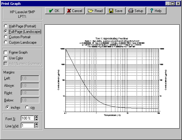
Note that you can adjust the font scaling and the line width in printed output.
Code Generation
If you do any scientific programming, you should find the code generation capabilities of TableCurve Studio to be a strong asset.
 Select the File Menu’s Code Generation option and then further select the Full Test Code option and the program language of choice. You must also specify the function, subroutine, or procedure name for the function code containing the fitted equation. Press OK and then input temp as the file name.
The correct language extension will be appended. The code is then generated and an ASCII listing of the file follows as a confirmation.
Inspect the generated code and then close the list window.
All 3665 of the built-in equations are eligible for code generation. The code is concise, even for polynomials and rationals, and double precision (15 significant digits) is generally used. If the equation contains the error function, its code is also automatically generated.
Spreadsheet Export
 The Excel export option offers three different levels of spreadsheet content, three different Excel formats, and a full generated data section with curve-fit equation.
The WK1 (Lotus-123) export option is similar to the full content Excel export except that the worksheet can optionally contain named graphs.
If you are an Excel, Lotus, or Quattro Pro user, select the Save Lotus 123 or Save Excel option in the Curve-Fit graph’s File menu. Press OK to accept the defaults and then enter the name temp and press OK.
If possible, the worksheet will contain a Lotus or Excel representation of the equation stored as a string. You will need to remove the leading string character to activate the formula, and you will need to copy it to any additional cells desired in the column. The X values are entered in the previous column. If you are using Excel v5 or higher, you can also generate Visual Basic code which can be inserted as a module into the worksheet. This makes the TableCurve Studio generated function accessible to cells just as if it were an Excel built-in function.
Note that you have full control over the range and size of the generated data section of this spreadsheet. For the Excel export, you may elect to create a worksheet with only the generated information, including confidence and prediction limits, or with just the X and Y values.
SigmaPlot Output
 If you are a SigmaPlot user, select the Save SigmaPlot option in the Curve-Fit graph’s File menu. Select the SigmaPlot format of choice and press OK. Enter the name temp and press OK to generate the SigmaPlot file.
This option generates a full-featured SigmaPlot worksheet containing publication quality graphs.
With the SigmaPlot output, you also have control over the range and size of the generated section of the worksheet. For most equations, you may also have TableCurve Studio generate a SigmaPlot XFM transform file that uses the same file prefix but has an XFM extension.
Exiting TableCurve Studio
 Click OK in the Curve-Fit Graph to exit the Review.
To exit TableCurve Studio, either close the main TableCurve Studio window, or use the Exit item in the main File menu.