Curve-Fitting Pitfalls
The purpose of this section is to illustrate some of the pitfalls that exist in curve-fitting science, and some of the ways they can be avoided. TableCurve 2D contains a significant number of features designed specifically to prevent the kind of errors that are common to curve-fitting.
Start With Good Data
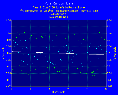
The greatest pitfall is probably using invalid data that consist either of erroneous values or some form of noise. An obvious requirement for effective curve-fitting is to have a respectable signal-to-noise ratio. The following data were generated with TableCurve 2D’s random number function. The linear trend indicated below by the straight-line fit is completely without merit.
Remove Outliers Rather Than Smoothing
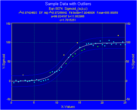
TableCurve 2D’s smoothing and denoising procedures are often very effective in removing noise from a data set. Smoothing is not, however, a good choice for dealing with outliers. The following data set, when fitted to a sigmoid, has four points outside a 95% prediction interval. The coloring of these points based upon the number of overall standard errors in the residuals likewise indicates outliers.
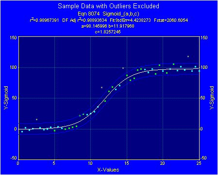
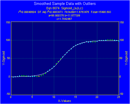
In the following example, the difference in transition width is greater than 5% between marking these points as inactive to exclude them from the fitting and smoothing the original data in an effort to minimize the impact of these outliers. The correct choice will usually be to exclude outliers from the curve-fitting.
Use Robust Fitting When Appropriate
Use TableCurve 2D’s robust fitting procedures when fitting a non-linear model (or are willing to fit a linear model by a UDF), and one or more of the following are true:
- the data span many orders of magnitude in Y and the low-valued Y points are not factoring into the least-squares fit.
- the distribution of residuals is likely to have broader tails than that of a Gaussian distribution.
- the data are noisy, outliers are suspected, but excluding these outliers is not straightforward.
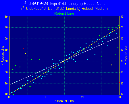
In the following example, noisy straight line data are fitted by least squares and by TableCurve 2D’s medium robustness procedure, that which assumes Lorentzian errors. Since robust methods assume a wider distribution of errors, such fits are less impacted by the outliers.
Beware Of Undefined Regions
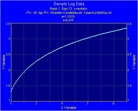
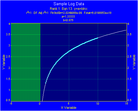
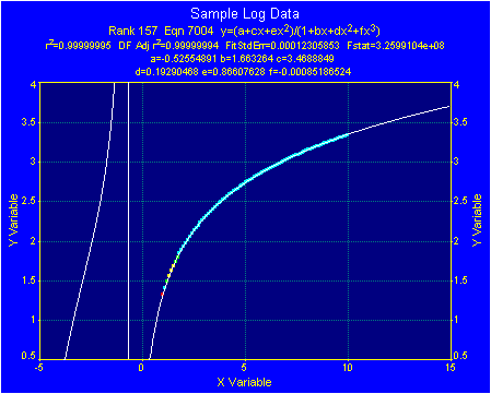
The following data set is fitted perfectly by the basic log equation. Zooming out shows a good chance of extrapolating to higher X-values, but as would be expected, not to values less than 0. Note the vertical bars that indicate math errors for negative X-values. If this equation were selected, the X-values would have to be restricted to values greater than 0.
Beware of Rational Equation Singularities
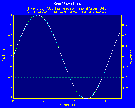
Many of the special functions offered in numeric packages are rational equations which resulted from fitting tabulated data. This is a testimony to the power of these equations for fitting a diverse spectrum of complex data. All is not paradise, however. Although the top graph shows a 10th/10th order rational function superbly fitting one wavelength of a sine-wave, the bottom graph shows this same 10th/10th order rational failing completely in fitting a simple data set containing multiple Y-observations for each X-value. Note the reasonably high r² value in the case with multiple singularities.
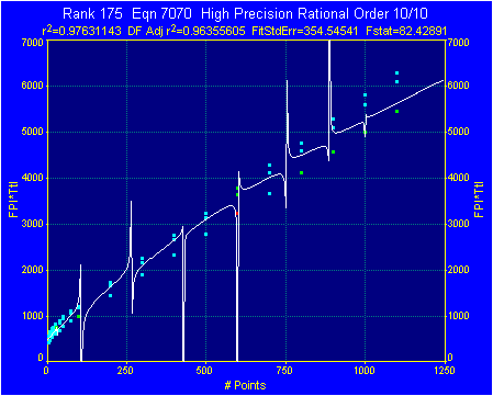
With noisy data, or when there are multiple Y-values for a single X, a rational equation tends to produce its characteristic undefined region(s). Since rationals are quotients of two polynomials, X-values corresponding to the roots of the polynomial in the denominator result in a division by zero thus producing an undefined condition or pole.
TableCurve 2D’s equation list incorporates a Rational Defined Xmin to Xmax filter. When this filter is checked, the denominator of a rational equations is checked for roots within the X-range of the data. If a root is found, the equation is filtered from the list.
For rational equations, TableCurve 2D’s Numeric Summary reports the numeric values for these poles. For denominators that are polynomials in x, all real roots are reported. For other polynomials, a bracketing and root finding are used to detect roots in the range of the data.
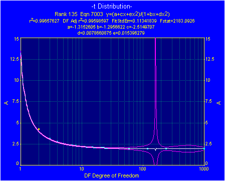
Even when there are no singularities in the data range, there is still a strong possibility rational equations will evidence undefined or unstable regions outside the X-data range, as in the graph that follows. If you are using a rational equation for extrapolation, inspect the region of interest very closely, including the confidence intervals.
Bear in mind that some poles are so small, they may not be drawn by the curve rendering algorithm. You must thus rely on the numeric report of roots. In those instances where a small blip is observed, such a data region can be shown to be quite unstable by inspecting confidence intervals, as in the graph that follows.
Beware of Extrapolating Polynomial Equations
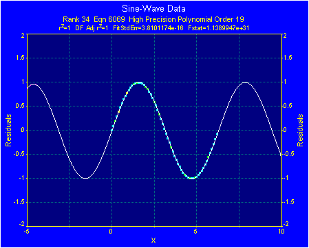
Polynomials do not suffer the undefined or unstable regions characteristic of rational equations. Polynomials have their own peculiar brand of pitfall, and most often this exists in the area of extrapolations. Relying on polynomials for extrapolations and forecasts can be ruinous. The lure is of a high r² fit that manages any number of complex data shapes such as the sine wave below where one wavelength is fitted almost perfectly by a 19th order polynomial.
The 4th order polynomial below, however, offers miserably poor extrapolations as well as fitting the noise within the data.

The failed polynomial extrapolations do not even take any consistent directions for a given data set. Both examples that follow are for the same data set.
Note how the 4th order polynomial evidences a very rapid drop in value when extrapolating to higher X-values. The 6th order equation, on the other hand, has exactly the opposite trend for extrapolations to higher X. Extreme caution is thus advised if you intend to use any of the higher order polynomials for extrapolations.
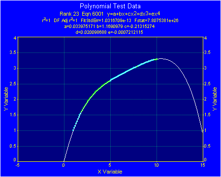
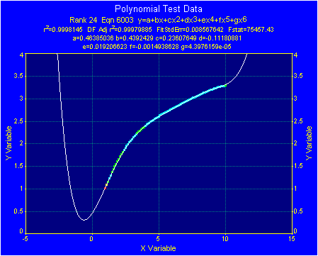
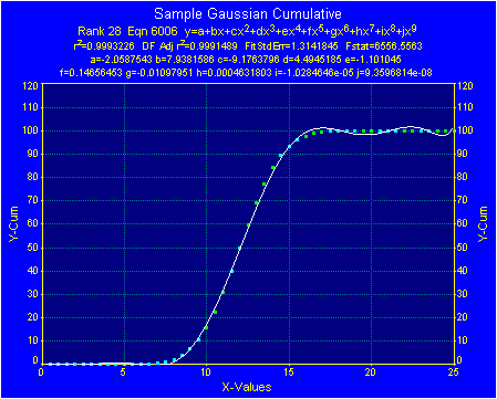
Higher order polynomials tend to do a superb job of fitting curves, but tend to do a very poor job when such curves are combined with relatively straight lines.
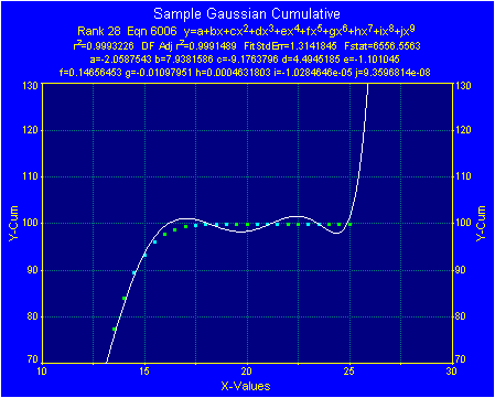
In this Gaussian Cumulative data set, the 9th order polynomial has a peculiar instability at the upper plateau. To see such trends more readily, TableCurve 2D offers you to means to zoom-in on graph to see any area of interest.
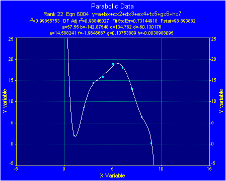
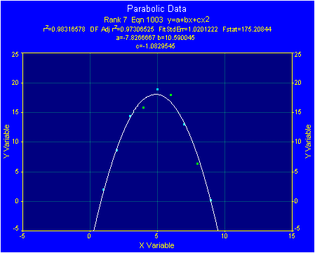
The most annoying trend of higher order polynomials must certainly be their ability to fit the noise with data. In the following example, noisy parabolic data is fitted to both 7th order and 2nd order polynomials. When fitting polynomials to data, the number of data points should significantly exceed the number of coefficients. Some statistical experts go so far as to recommend that your data point count be at least five to ten times the number of coefficients fitted.
Failure To Examine Data At Low X And Y Values
Although there are different ways to calculate a goodness-of-fit criteria, most are strongly sensitive to the magnitude of the differences between the actual and predicted Y-values. This is especially true when the Y-values span more than one order of magnitude. The least-squares method generally uses absolute differences rather than any normalized form, and as such the goodness-of-fit values may not reflect the quality of the curve-fit at this low end of the data range. This is why numerical indices of fit should only be used only as starting references. The curve-fit in such instances should always be closely examined at low Y values.
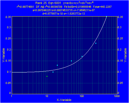
When the following data set is fitted to a 4th order polynomial equation, all indications by r² and by initial appearance are of a very successful fit. Much of the data, however, is concentrated at low values of Y.
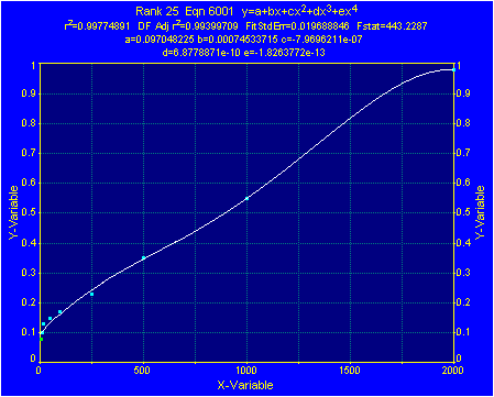
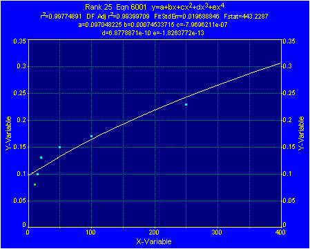
Note how the quality of the curve-fit in this lower region is shown to be less than ideal by first zooming in and then by setting a logarithmic X-axis. The zoomed-in semi-log graph clearly shows a trend in the data that this equation altogether fails to fit. In this instance, a good approach would be to scan the candidate equations with this zoomed-in semi-log scaling until finding one that does fit this trend at the low end of the Y-data range.
Reversing X And Y Values
Another pitfall worth noting involves a misunderstanding of the curve-fitting process. Most curve-fitting software is designed to fit data tables in which there is one discrete Y-value for each X-value. If there are more than one Y-value for each X-value, all curves will fit a single Y-value to this X-value. This is seldom a problem with original data, since real-world data usually consists of single observations of X and Y for each data point. When an experiment ramps up in X-values and then back down again, it is common procedure to do separate data analyses for the ascending and descending processes.
The difficulty more commonly appears when X and Y values are reversed in hopes of achieving an equation in which X is given as a function of Y. In programming, such a procedure is far more code-efficient and time-efficient than root finding routines. The pitfall lies in the fact that this reversal will not result in a successful curve-fit equation on certain types of data tables. In particular, y of x must be single valued.
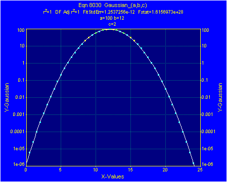
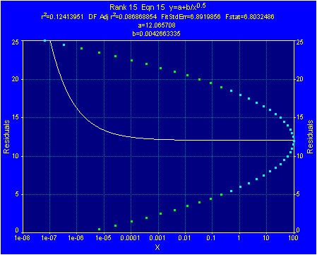
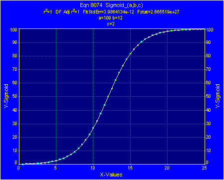
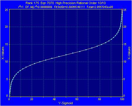
Peak-type data, such as the Gaussian in the first two graphs which follow, is one data type that cannot be reversed. This is also true of waveforms and some parabolic curves. Transition data, such as the sigmoid data in the graphs following the Gaussian, can be successfully reversed. In this case it is successfully fitted by a rational polynomial.
Trusting Numbers Rather Than Your Eyes
Some scientists and engineers developed curve-fitting skills in times when primitive number crunching software was the rule. The results of a curve-fitting effort were always numbers, residual tables, and possibly a simple residuals plot. Many pitfalls existed within this framework simply because so much was hidden. Although numeric goodness-of-fit values are good places to start, the selection of a curve-fit equation should be graphical. TableCurve 2D graphically displays the important aspects of the curve-fit process and encourages you to use your eyes and your judgment to discern the most appropriate model for your data.